Sci-Squad: Transforming Safety Rules into Superpowers
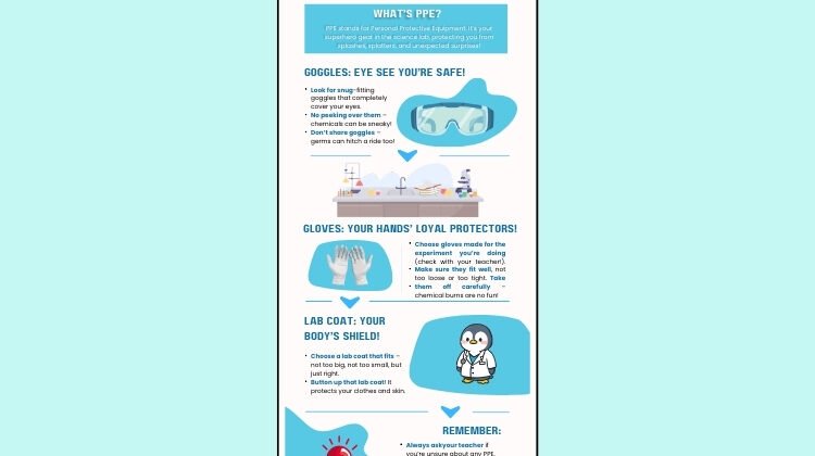
Designing safe and meaningful learning experiences goes beyond written instructions. Visual media often does the heavy lifting by turning essential information into something students can understand at a glance. In this project, I created an infographic that introduces science students to the proper use of personal protective equipment (PPE) in the lab. The goal was to take familiar but sometimes overlooked safety routines and translate them into a visual guide that is clear, memorable, and friendly enough for young learners to revisit often.

The infographic grew out of the scenario for the Lab Safety curriculum. As I analyzed the learning objective, I focused on how visual hierarchy, color, and iconography could help students sort through the different pieces of equipment they need to wear. I wanted the design to feel inviting, not overwhelming, while still reinforcing the seriousness of safe lab behavior. The final product uses a science-lab palette, simple typography, and clean structure to support quick understanding and easy classroom use.
The Design Process
To make my design choices transparent, I recorded a brief screen-capture walkthrough that explains how I applied principles of contrast, alignment, proximity, and repetition. The video highlights the practical reasoning behind the layout, the challenges I encountered while refining the structure, and how each decision helped keep the learning objective at the center of the design. Together, the infographic and the walkthrough show how thoughtful visual design can strengthen instructional media and support safer science learning environments.
| Erick | Bugah |